A branding concept for a weekend screening event of Ways of Seeing at Cinema Ideal, celebrating John Berger’s influential series on art, perception, and visual culture.The identity translates Berger’s ideas into a bold, geometric visual system designed to feel both analytical and contemporary.
OVERVIEW
Year:
2023
Location:
Portugal
Type:
Academic Project
Services:
Branding
Logo Design
Digital Assets
Webdesign
Logo Design
Digital Assets
Webdesign
The Challenge
The brief was to develop an experimental visual identity for a cultural event centered on Ways of Seeing. The system needed to reflect Berger’s critical thinking on perspective, power, and visual language while remaining adaptable across multiple formats. The challenge was to reinterpret a historically significant series without relying on nostalgia, creating something visually dynamic and relevant for a contemporary audience.
The Approach
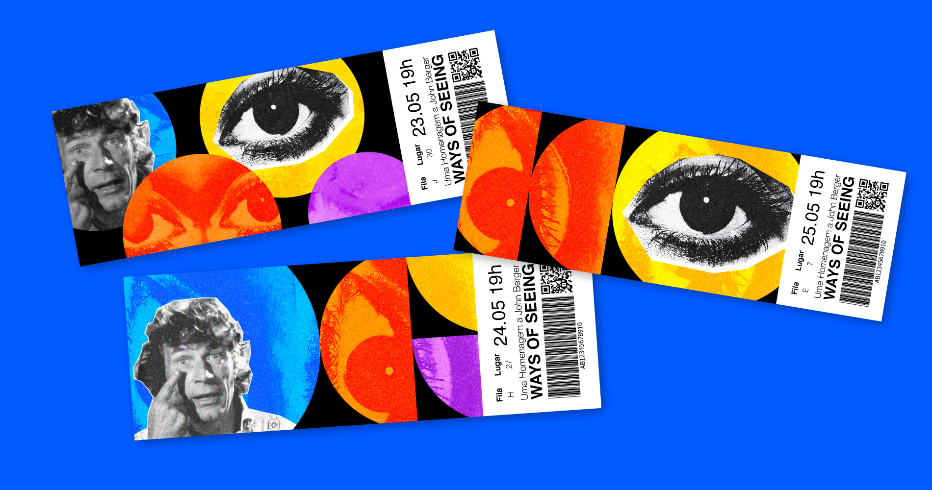
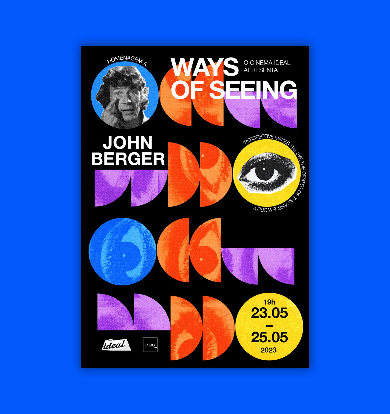
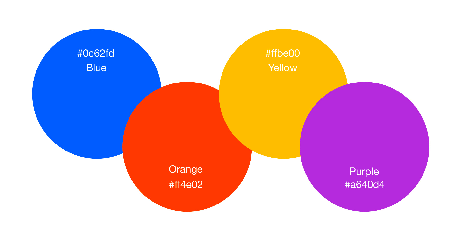
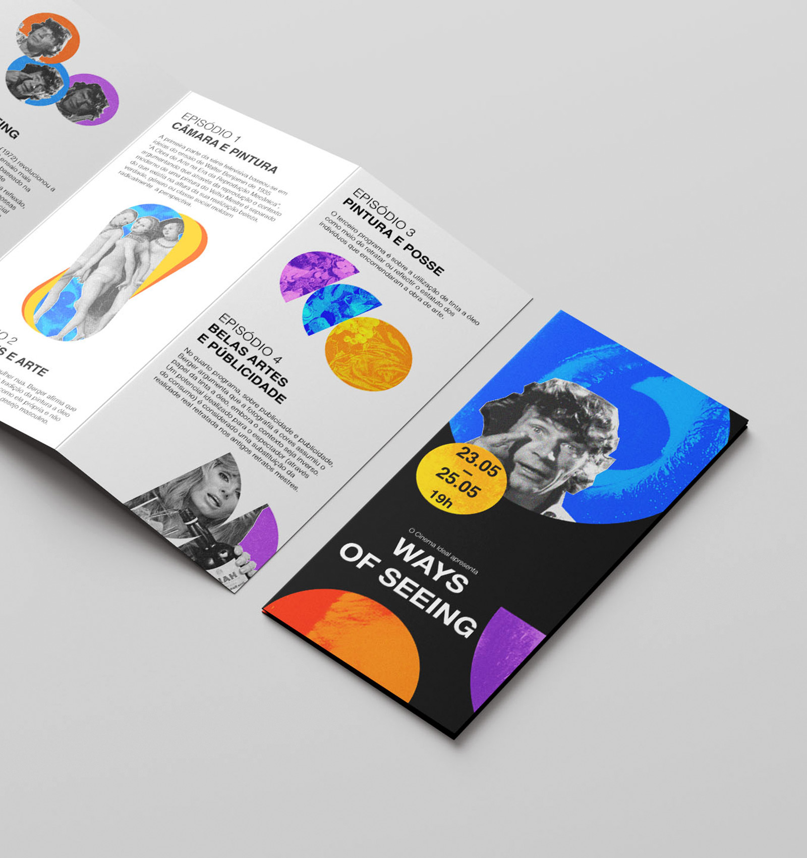
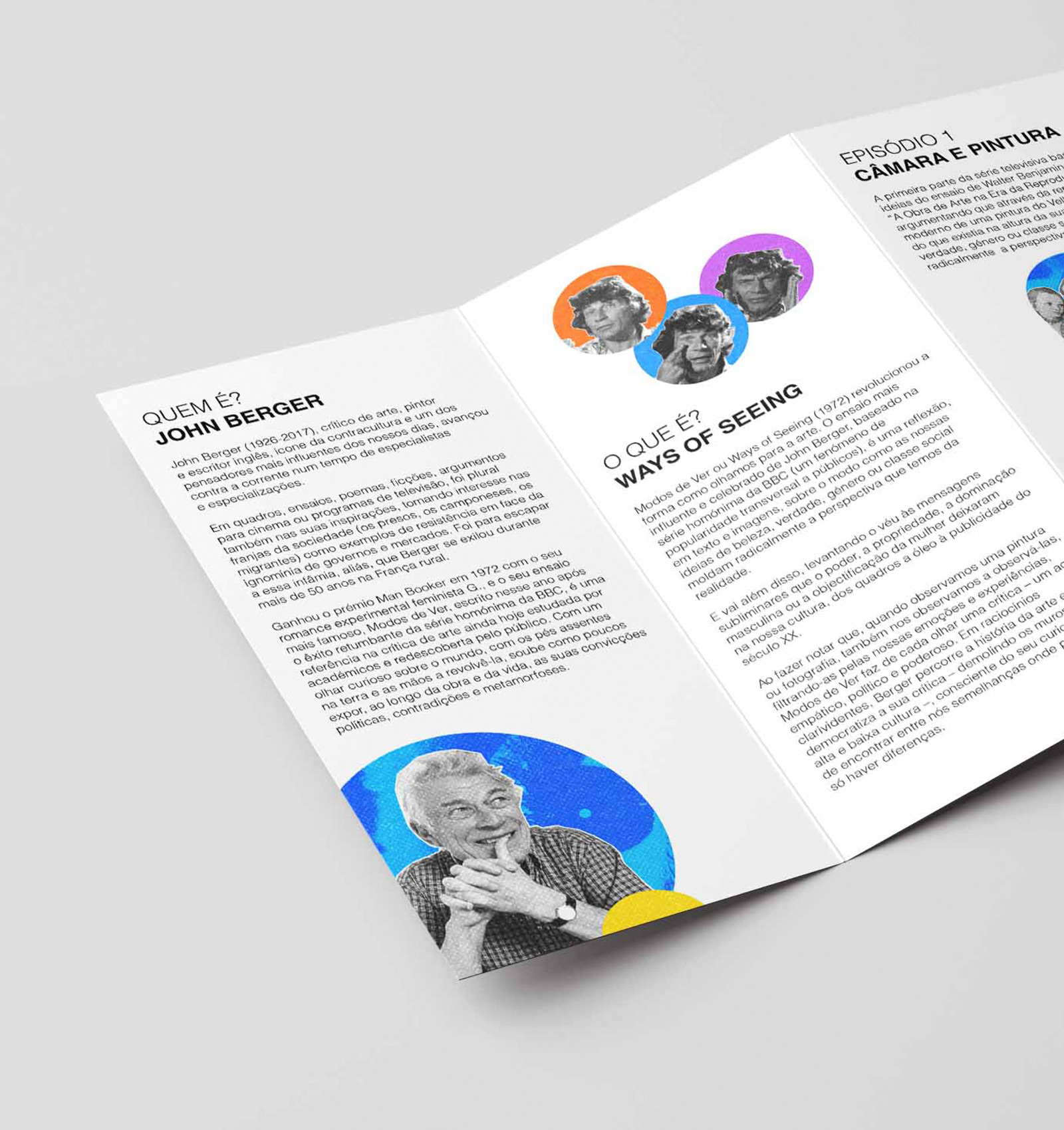
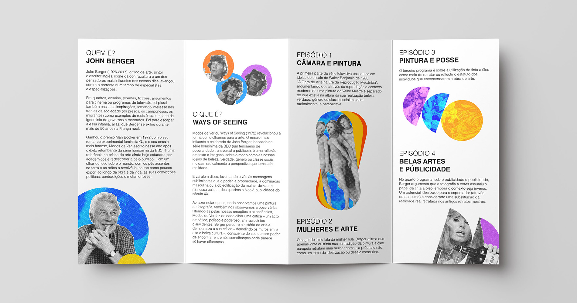
The identity is built primarily from geometric forms, with a strong emphasis on circles. The circular motif represents continuity, interaction, and perspective, echoing the cyclical nature of seeing and re-seeing that defines Berger’s work. Photographic fragments of Berger were integrated into the compositions, highlighting his expressive presence and reinforcing the importance of the eye as a symbol of perception and critical awareness.The result is a flexible system where circles can shift, overlap, and reconfigure while preserving a coherent visual language.
The Application
The identity was applied across stationery, tickets, and social media materials for the event. The modular nature of the geometric system allows variation while maintaining consistency, demonstrating how the brand adapts across different touchpoints.
The Outcome
This project strengthened my ability to translate theoretical concepts into structured visual systems. It also expanded my exploration of saturated color within a disciplined typographic framework. The result is an identity that feels analytical yet vibrant, reflective of Berger’s thinking while engaging a contemporary audience.