Na Wall is an independent comedy production company based in Cascais, Parede. The rebrand gives the brand a more playful and distinctive personality, combining an underground visual language and a flexible system designed for its different live shows.
OVERVIEW
Year:
2026
Location:
Portugal
Client:
Brand Identity / Rebrand Project
Services:
Visual Identity
Logo Design
Poster Design
Social Media
Logo Design
Poster Design
Social Media
The Challenge
Na Wall’s previous identity no longer reflected the personality of the brand or its independent approach to comedy. The challenge was to create a more distinctive and playful identity while maintaining the underground character of its shows, as well as building a system flexible enough to differentiate between its two event formats.
The Approach
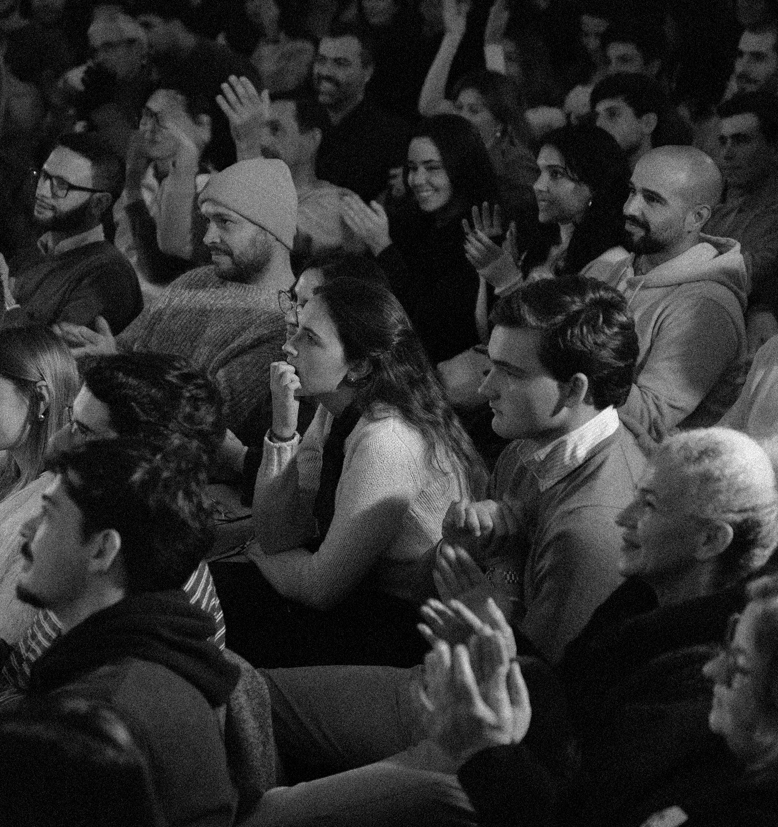
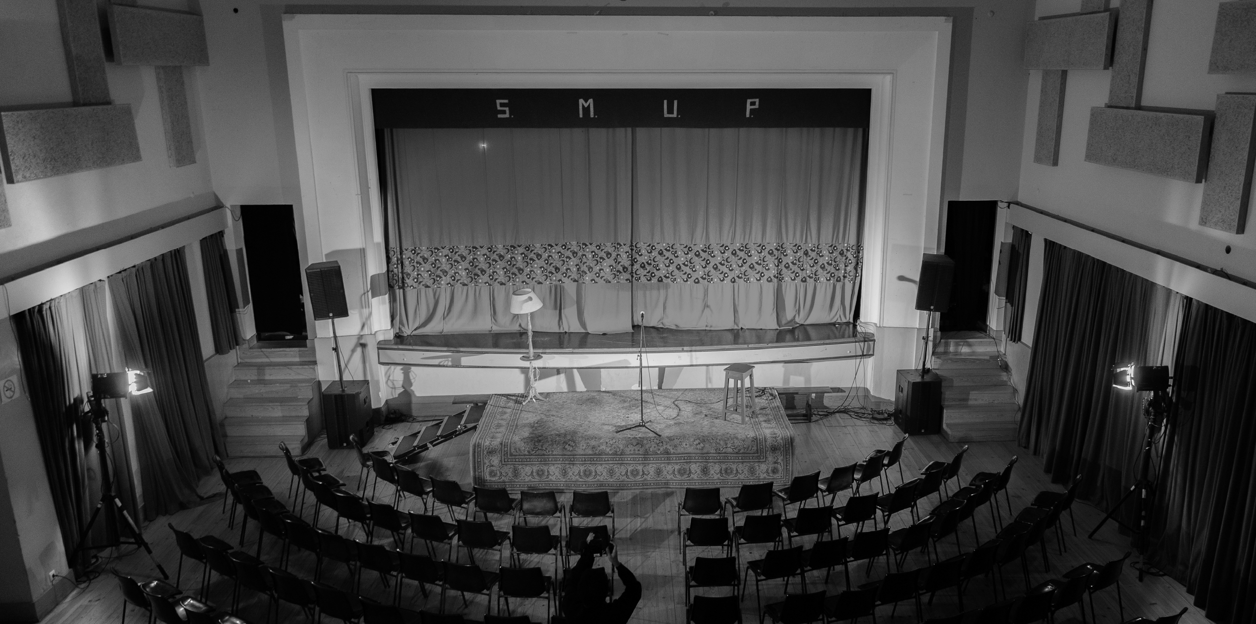
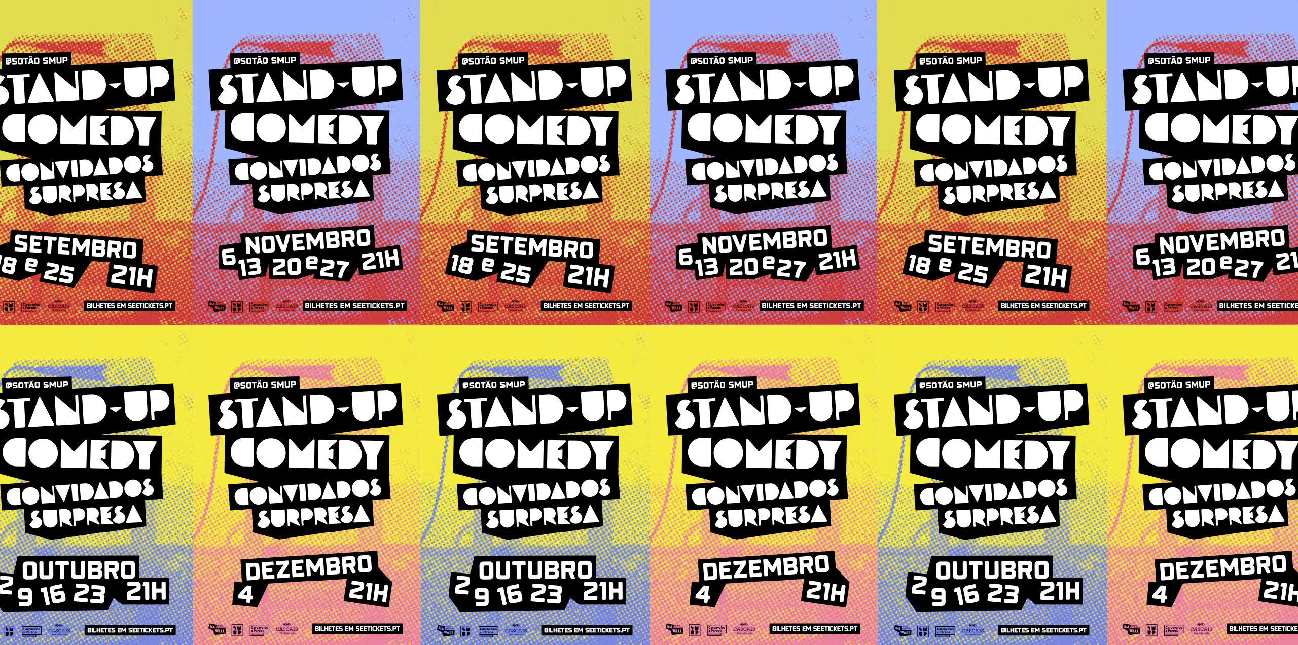
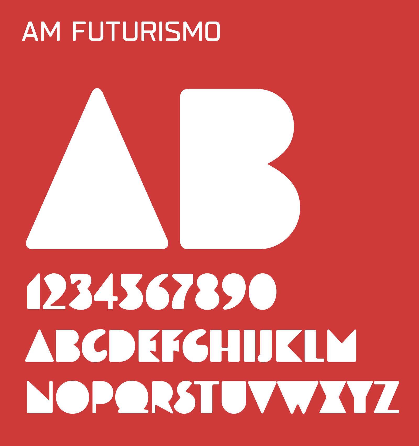
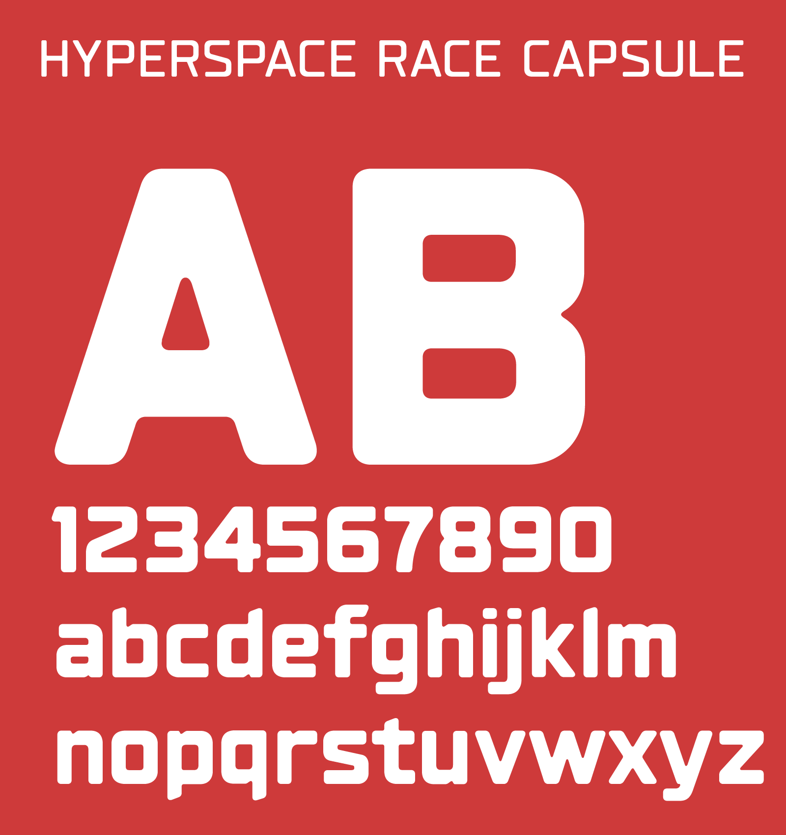
The visual identity takes inspiration from the name Na Wall and the raw, spontaneous character of underground spaces. The logo and typographic system explore bold, slightly irregular forms that feel organic and rebellious, while still maintaining a strong structure. Rather than relying on a dark underground aesthetic, the identity introduces vibrant pastel colours with a nostalgic quality, referencing the atmosphere of an old attic. Image editing, black-and-white photography, and gradient maps add texture and contrast, creating a visual language that feels playful, independent, and slightly unexpected.
The Application
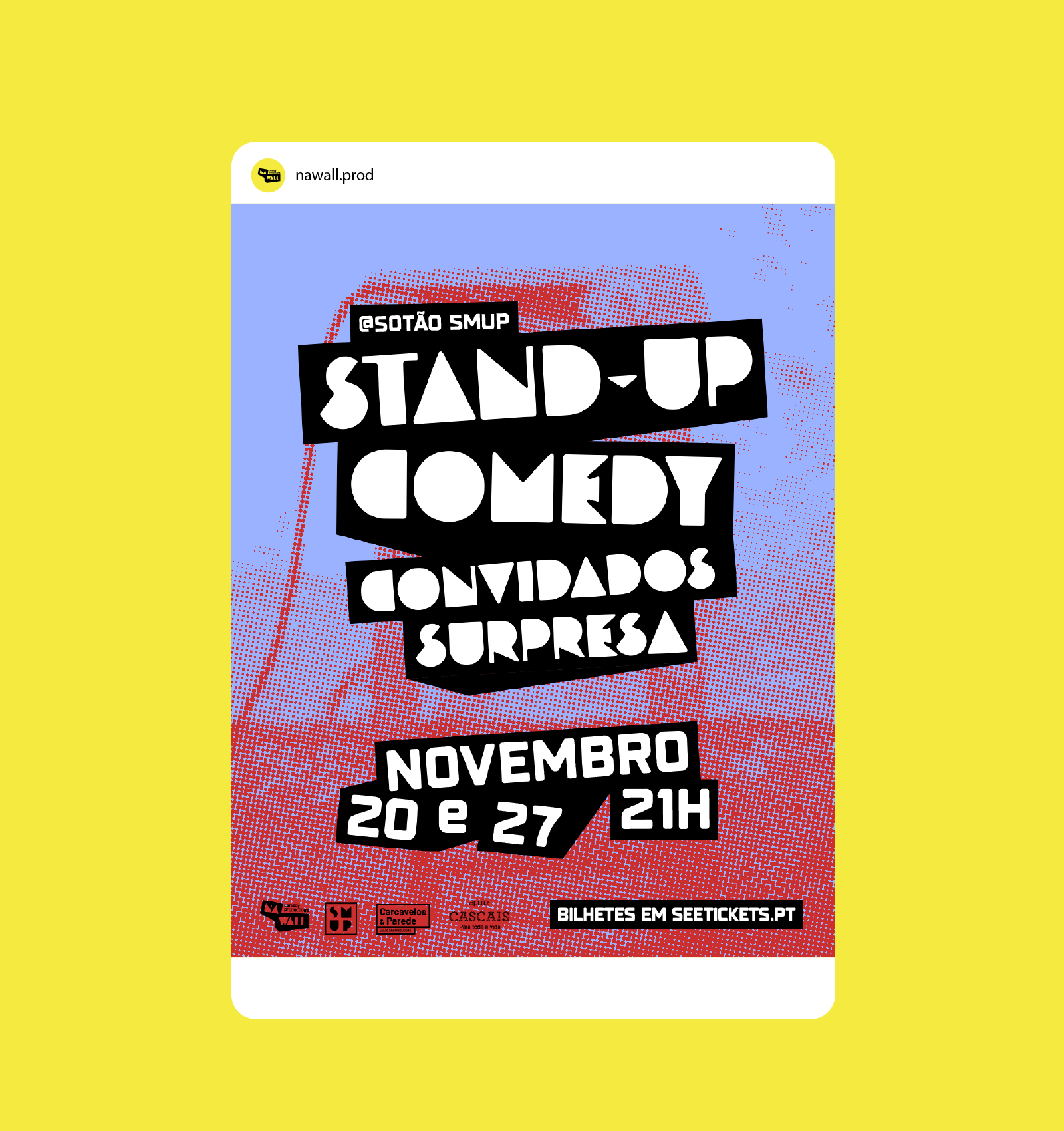
The identity was developed across two poster systems and a set of social media templates. Each event format has its own visual treatment, allowing attic and salon to feel distinct while remaining part of the same brand.Black-and-white comedian photography, expressive typography, colour, and image treatments can be combined in different ways, creating a flexible system that adapts easily to new line-ups and dates. The social templates were also designed to be reusable, allowing the client to update content independently while maintaining visual consistency.
The Outcome
The result is a recognisable and flexible identity that gives Na Wall a stronger visual personality while allowing each event to develop its own character. The system balances consistency with variation, making it easy to adapt across different shows, comedians, dates, and digital formats without losing the identity of the brand.