MAAT Transversal is a branding concept for a hypothetical exhibition at the MAAT Museum, exploring the intersection between technology and human-made artistry. The identity reflects the tension and dialogue between digital precision and human gesture.
OVERVIEW
Year:
2023
Location:
Portugal
Type:
Academic Project
Services:
Branding
Logo Design
Digital Assets
Webdesign
Logo Design
Digital Assets
Webdesign
The Challenge
The brief required the development of a visual identity for a speculative exhibition aligned with MAAT’s values, innovation, experimentation, and cultural dialogue.The challenge was to create a system that could visually reconcile two seemingly opposing forces: technological structure and human expression.
The Approach
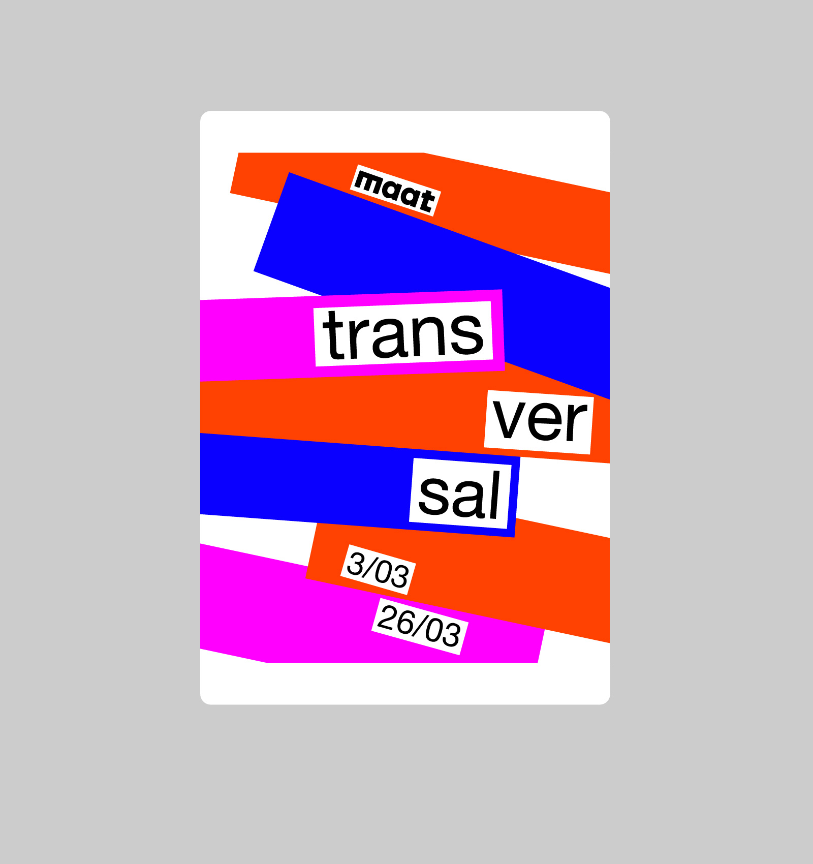
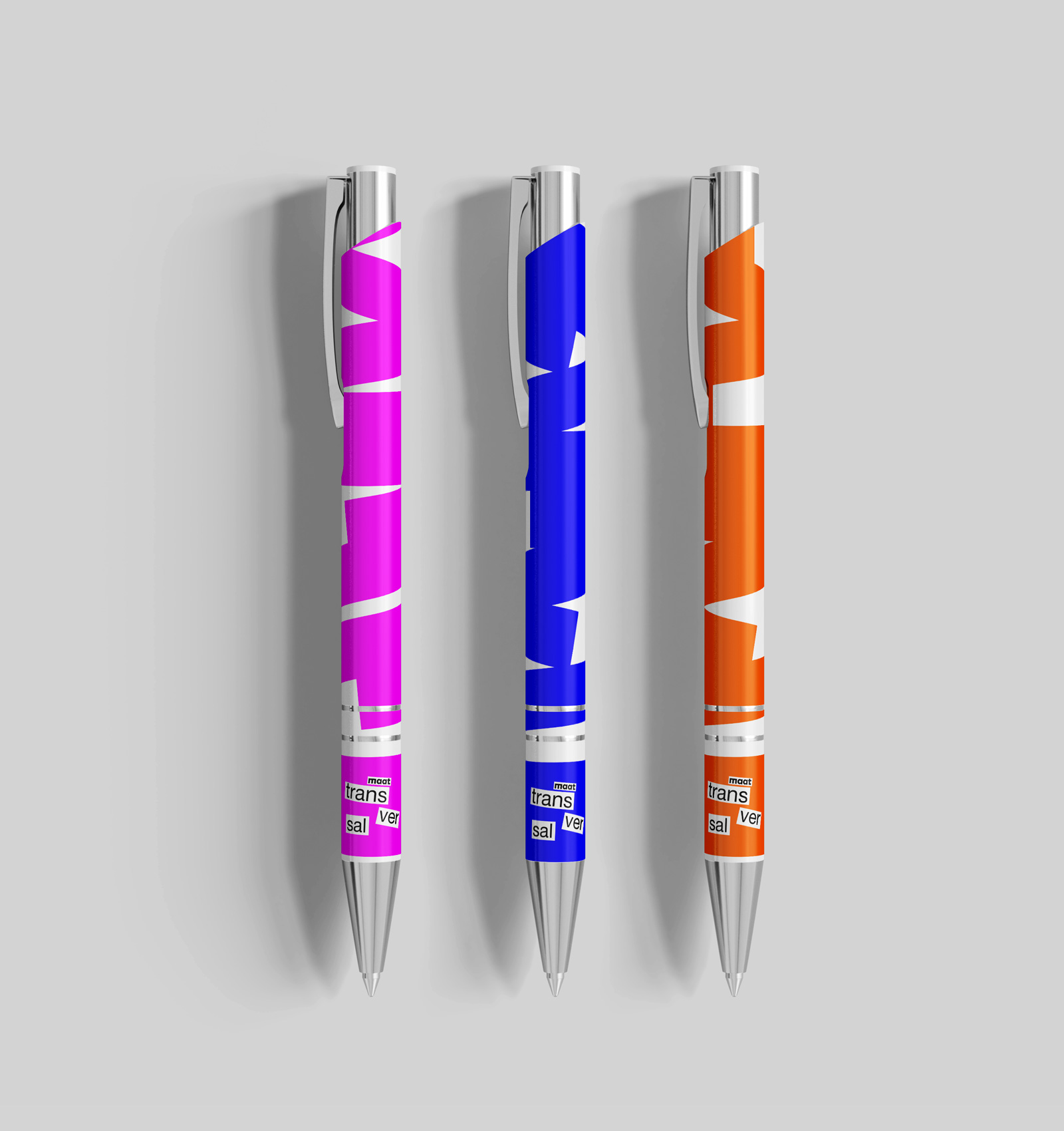
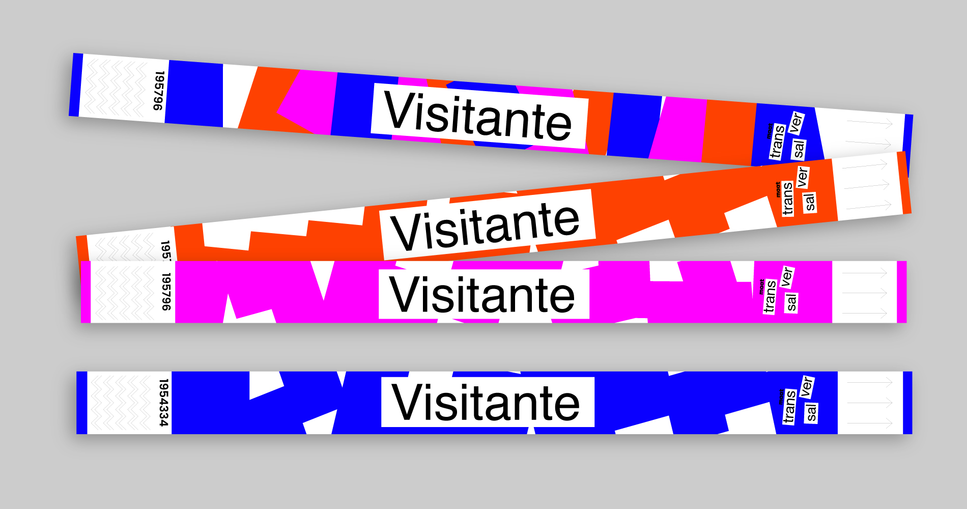
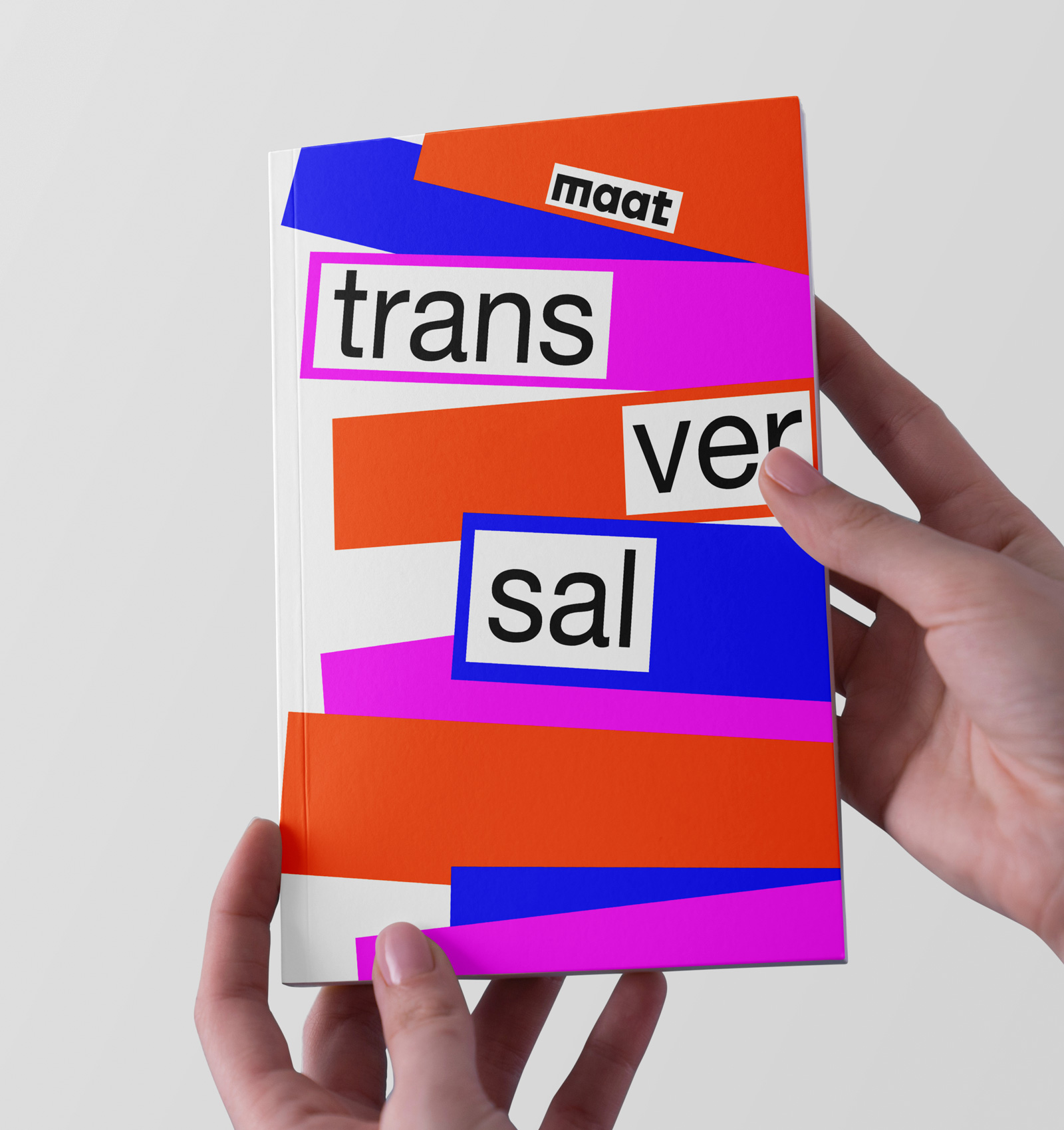
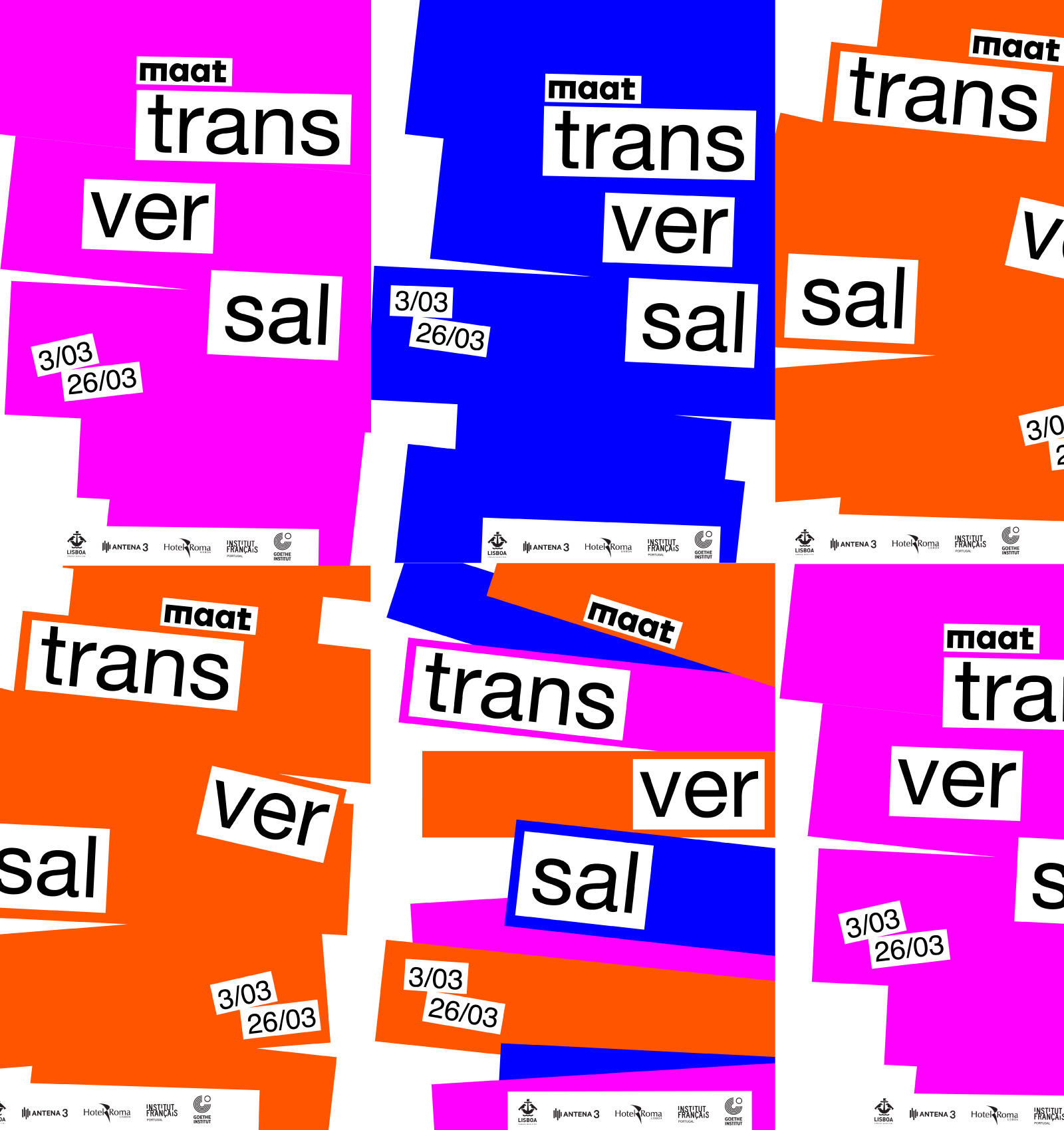
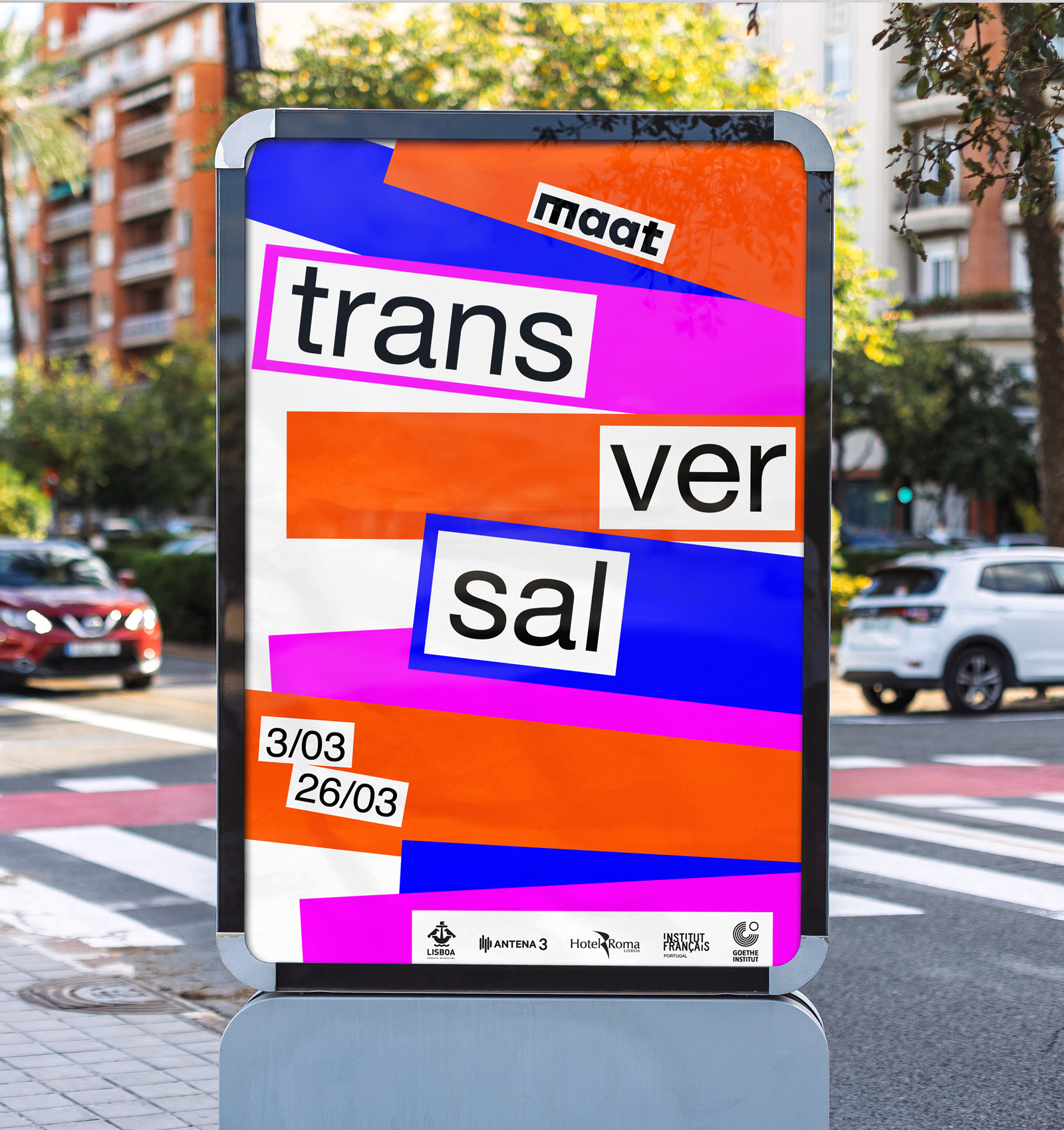
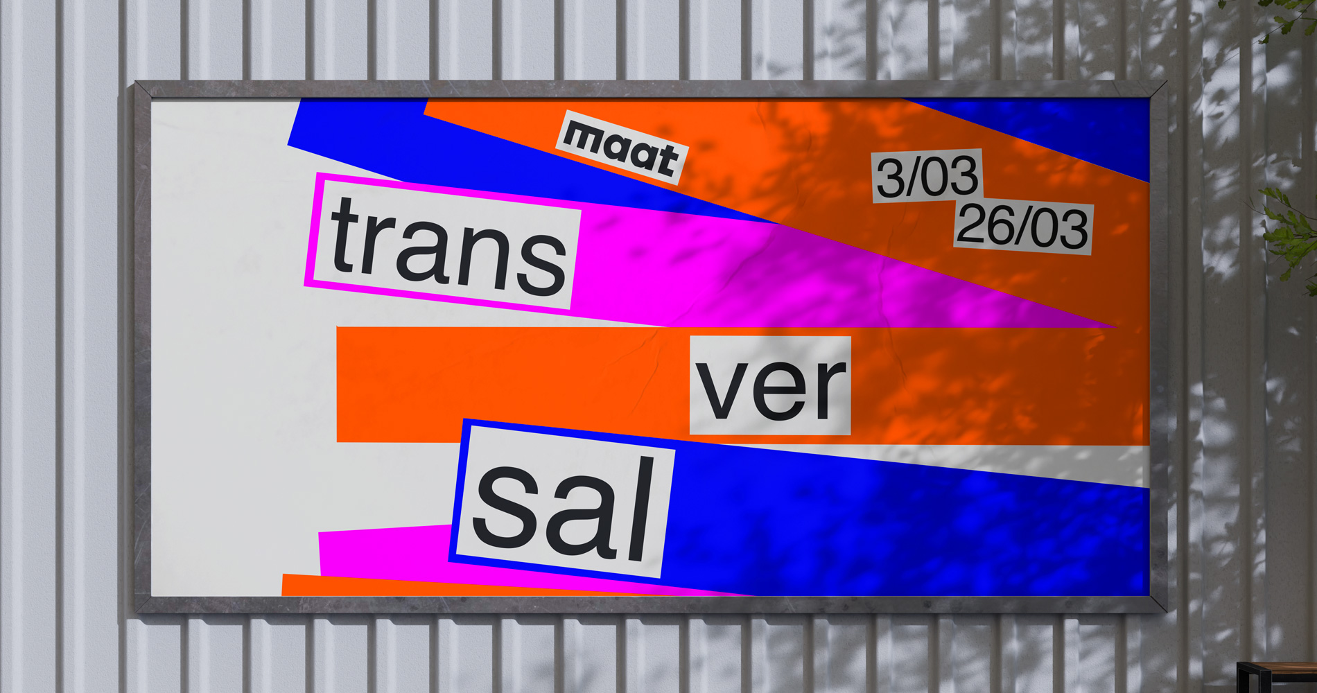
The visual system emerged from the combination of hand-drawn sketching and digital construction. I explored how spontaneous marks could coexist with rigid geometric forms. Rectangular compositions and neon color accents represent the technological dimension, while sketch-based elements introduce human presence and imperfection. This contrast creates a layered system that reflects the exhibition’s core theme, coexistence rather than opposition.
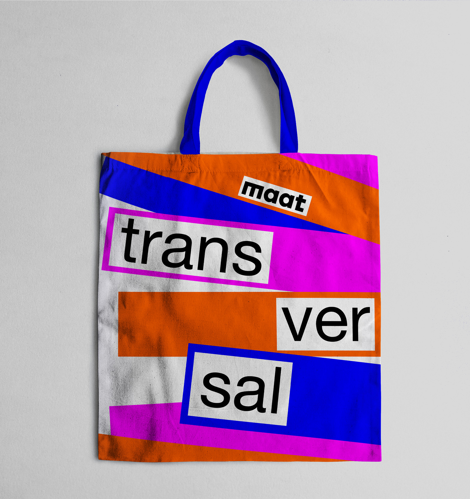
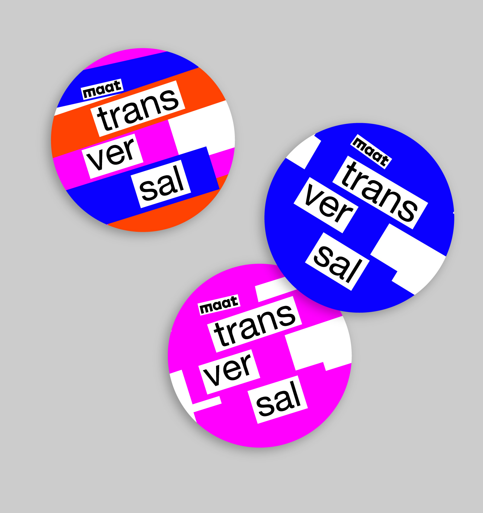
The Application
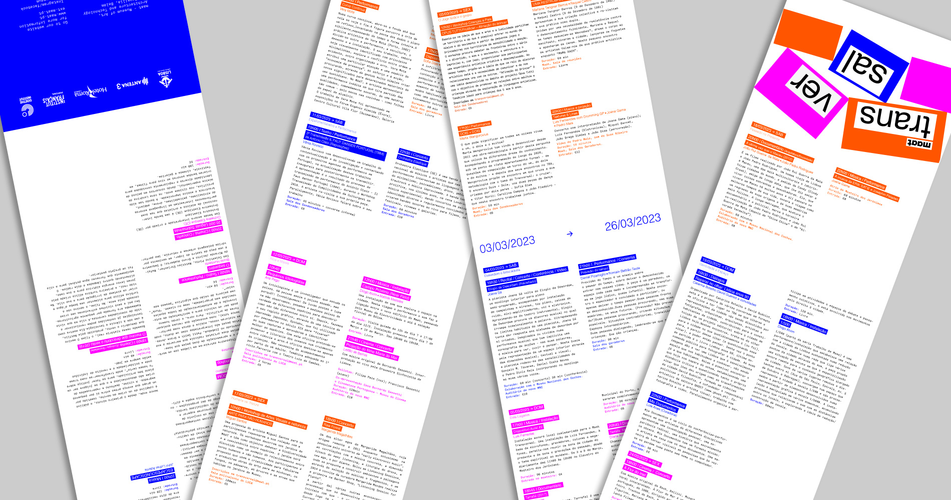
The identity was applied across printed materials, stationery, merchandise, and motion assets. The modular structure allows the rectangles, sketches, and color system to shift and reconfigure while maintaining visual coherence.
The Outcome
The project demonstrates a flexible and cohesive branding system capable of adapting across physical and digital formats.It strengthened my ability to build visual identities that balance experimentation with structure, while maintaining consistency across multiple touchpoints.