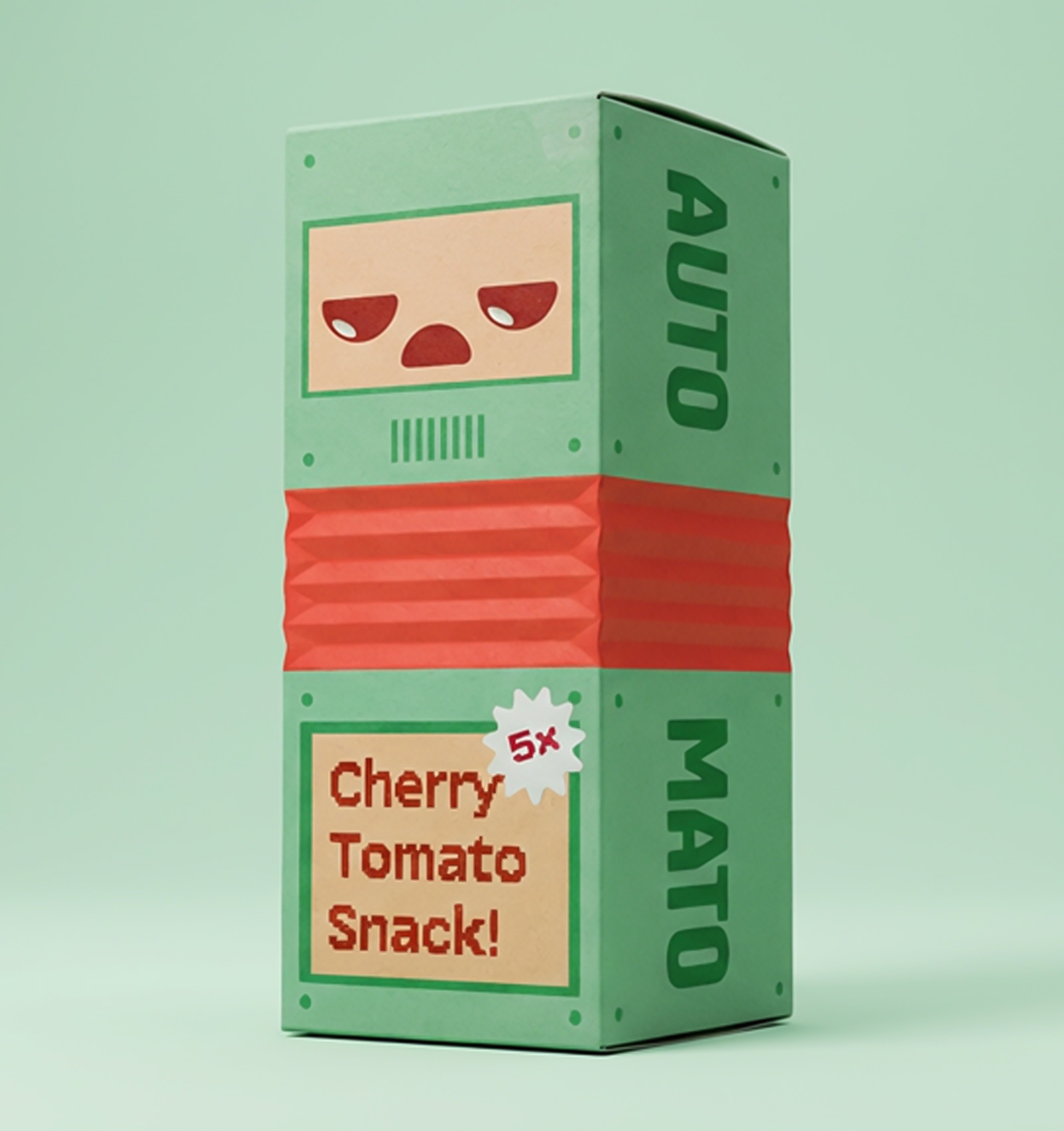
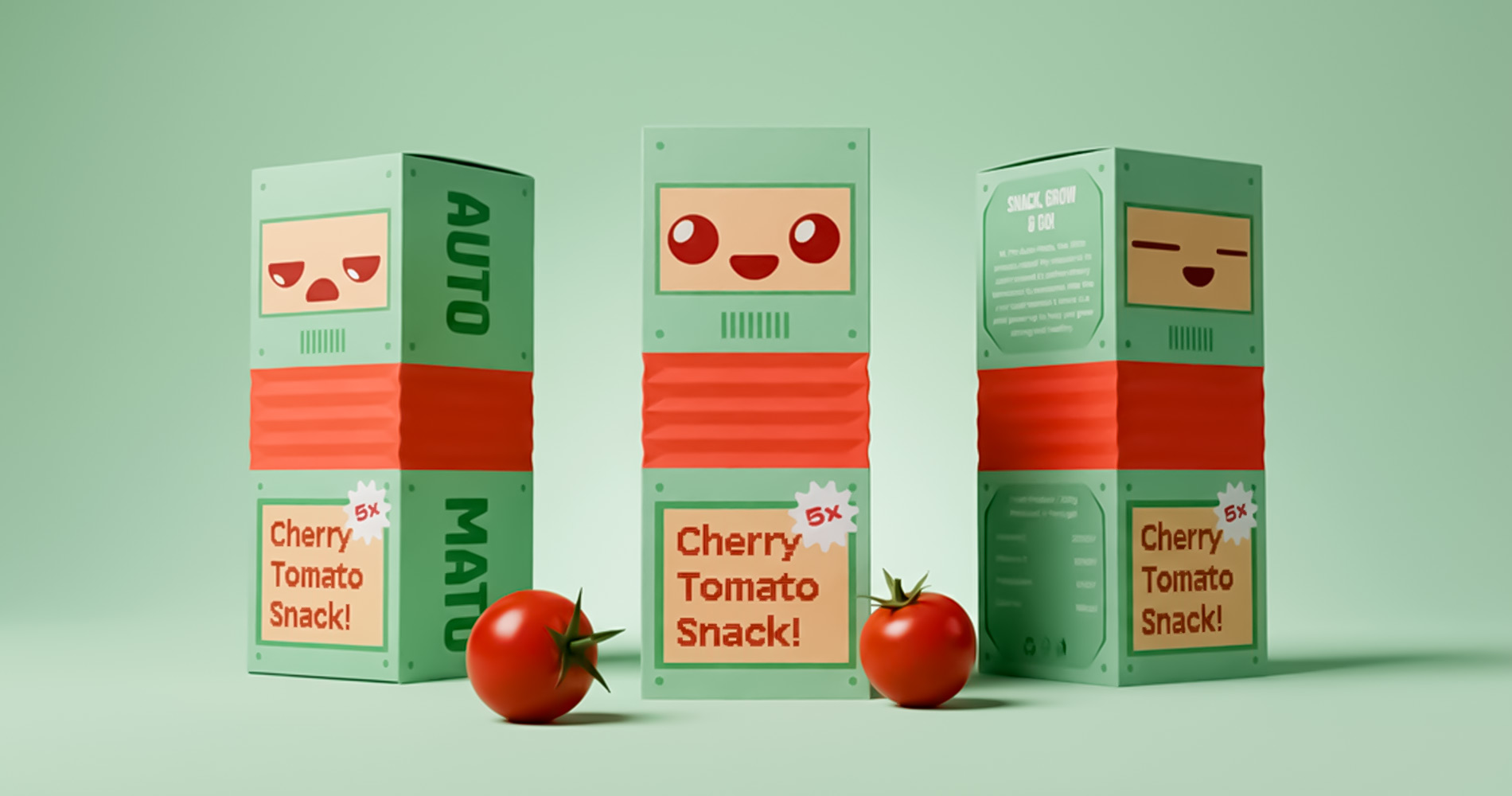
Auto Mato is a packaging concept designed to make healthy snacking more engaging for children. Centered around cherry tomatoes, the project reimagines how fresh produce can compete visually and emotionally with conventional snack brands.
OVERVIEW
Year:
2025
Location:
Portugal / UK
Type:
Academic Project
Award Winning Project
Award Winning Project
Services:
Branding
Logo Design
Package Design
Illustration
Logo Design
Package Design
Illustration
The Challenge
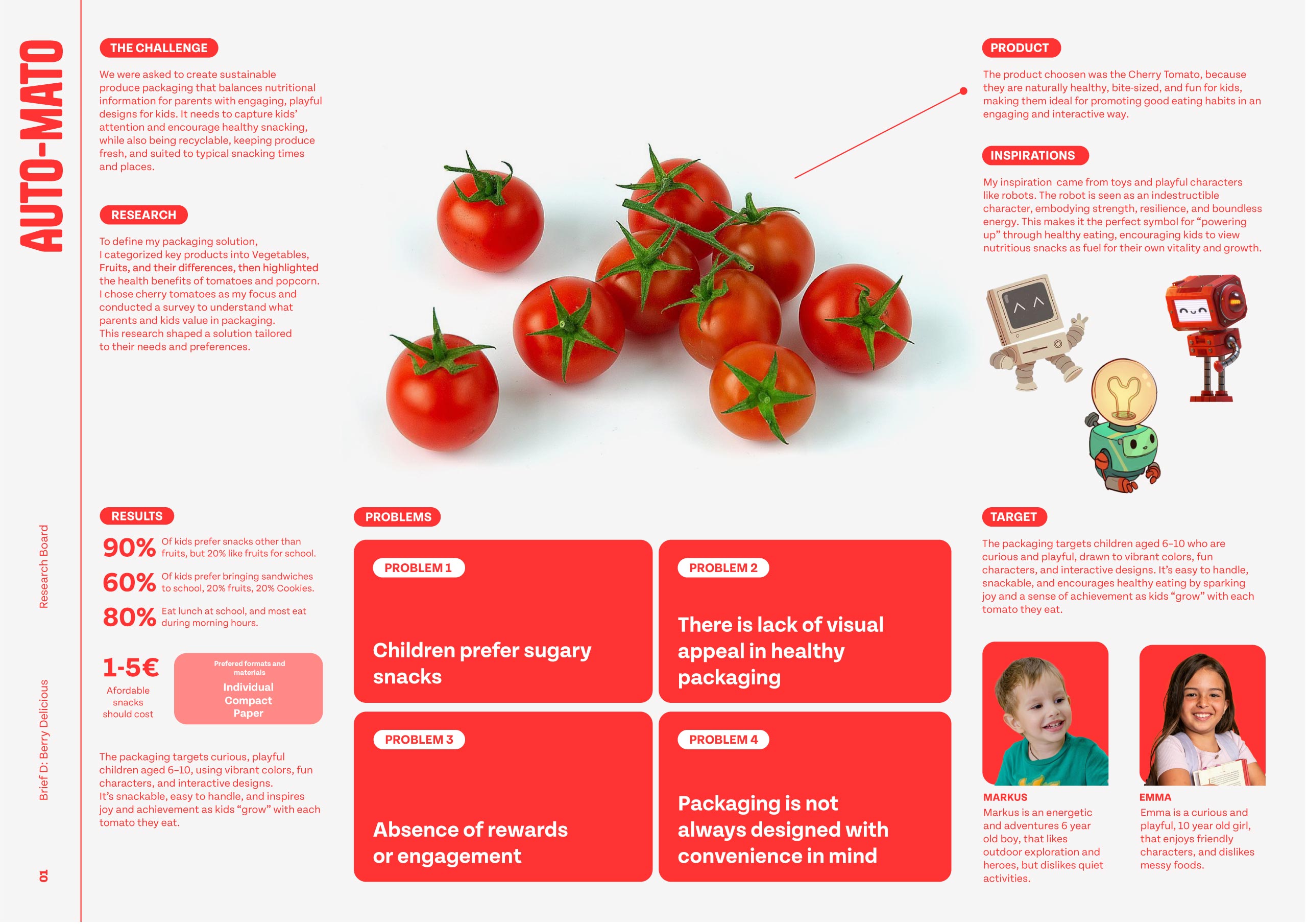
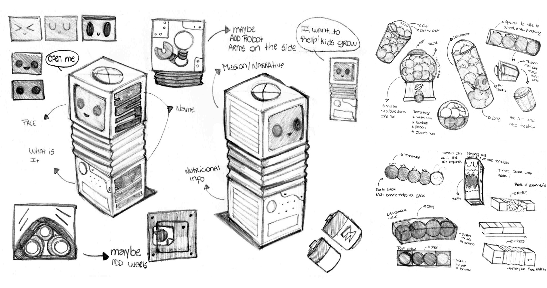
The brief called for a practical packaging solution for fruits or vegetables that would encourage healthier habits while remaining convenient for both children and parents. The challenge was to design something functional and portable, without sacrificing excitement, addressing the gap between nutritious food and the playful appeal typically found in processed snacks.
The Approach
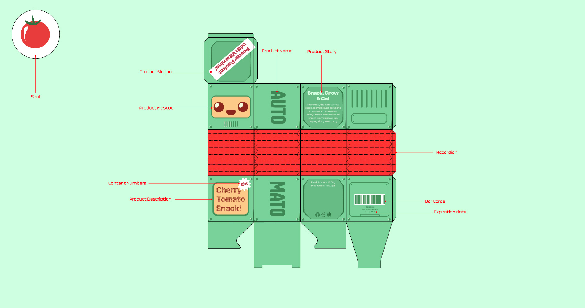
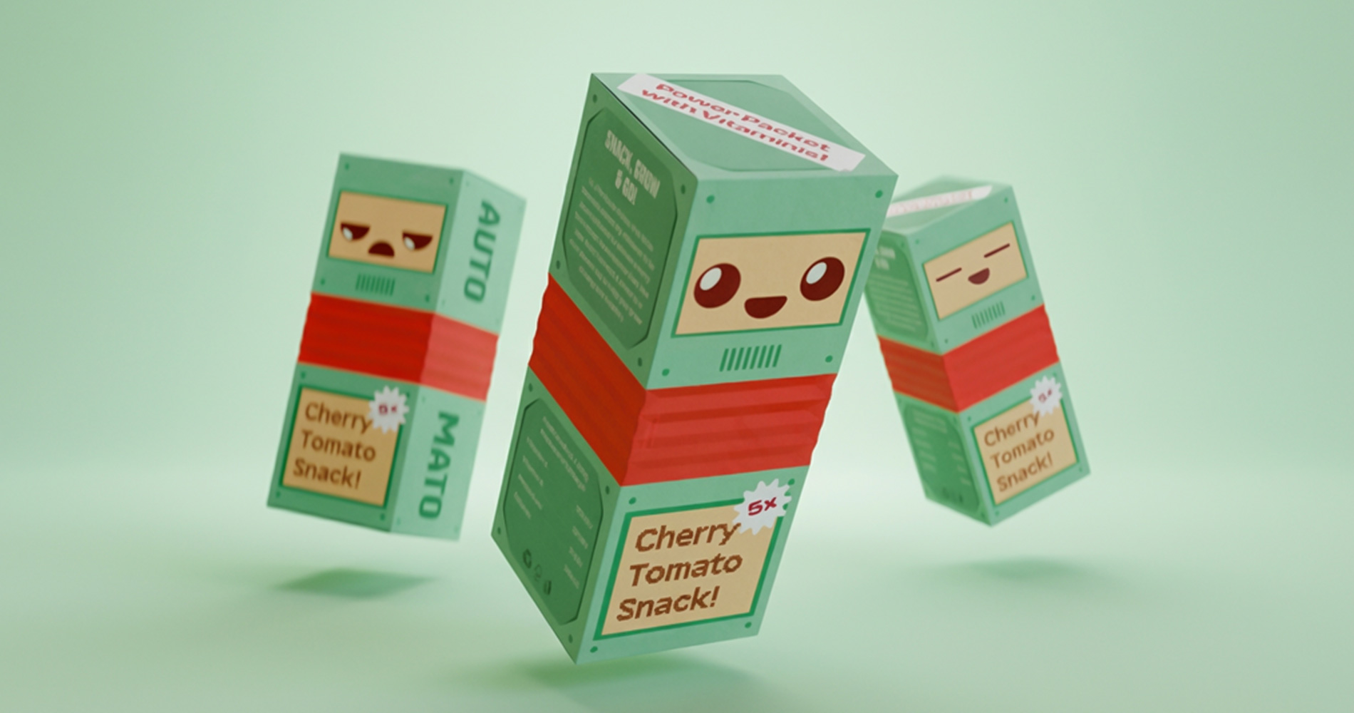
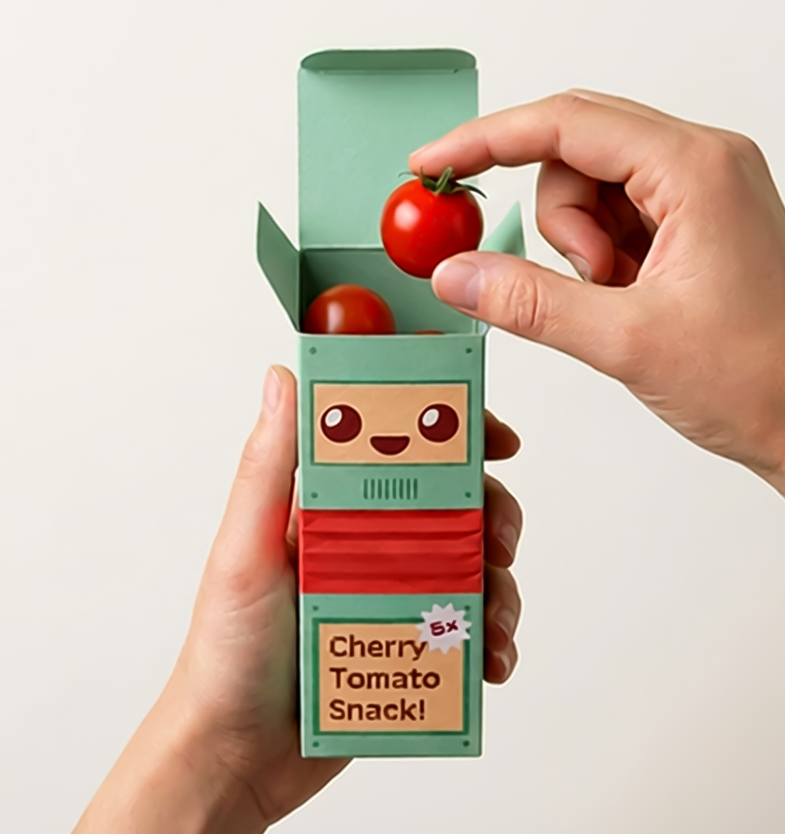
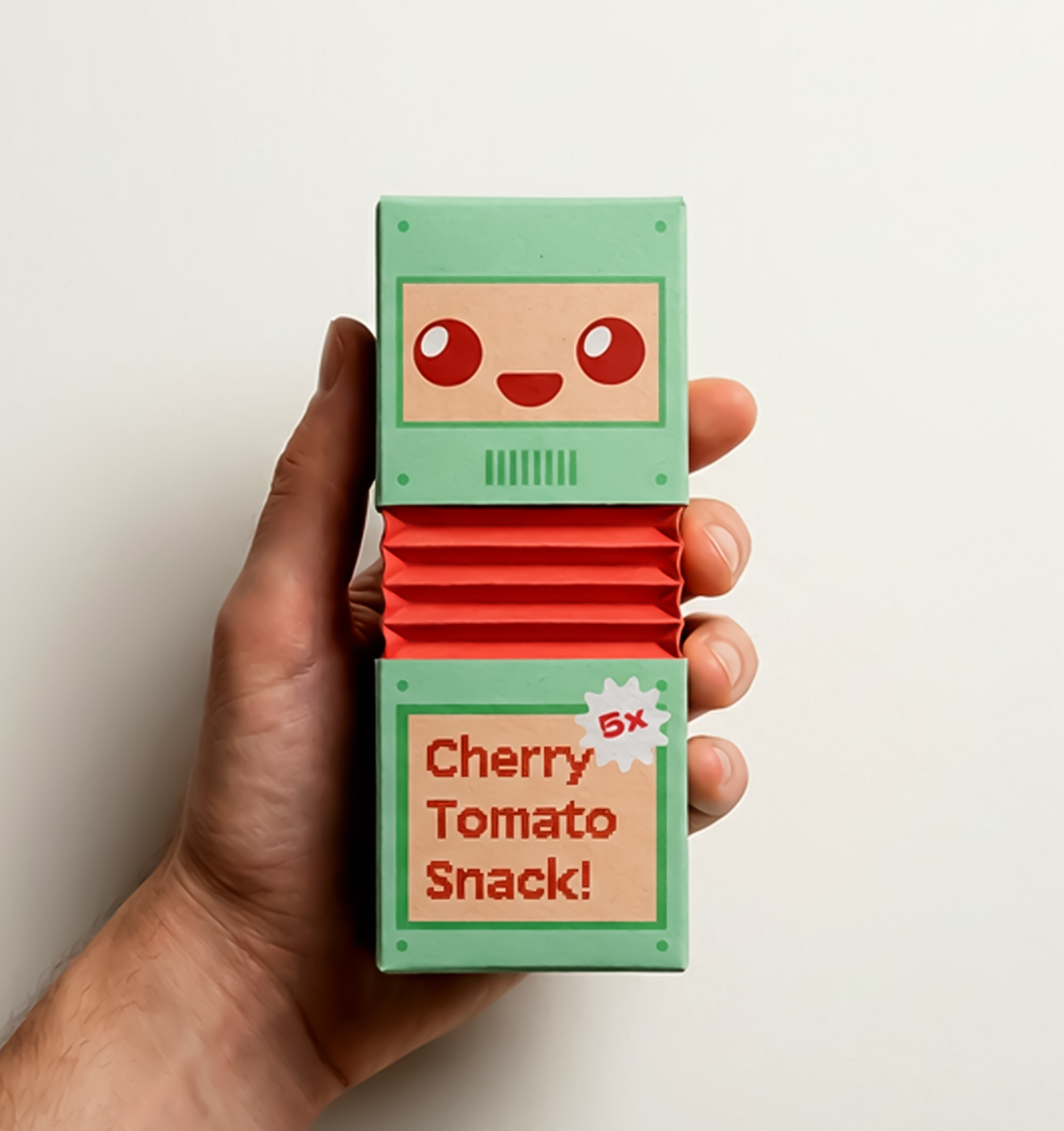
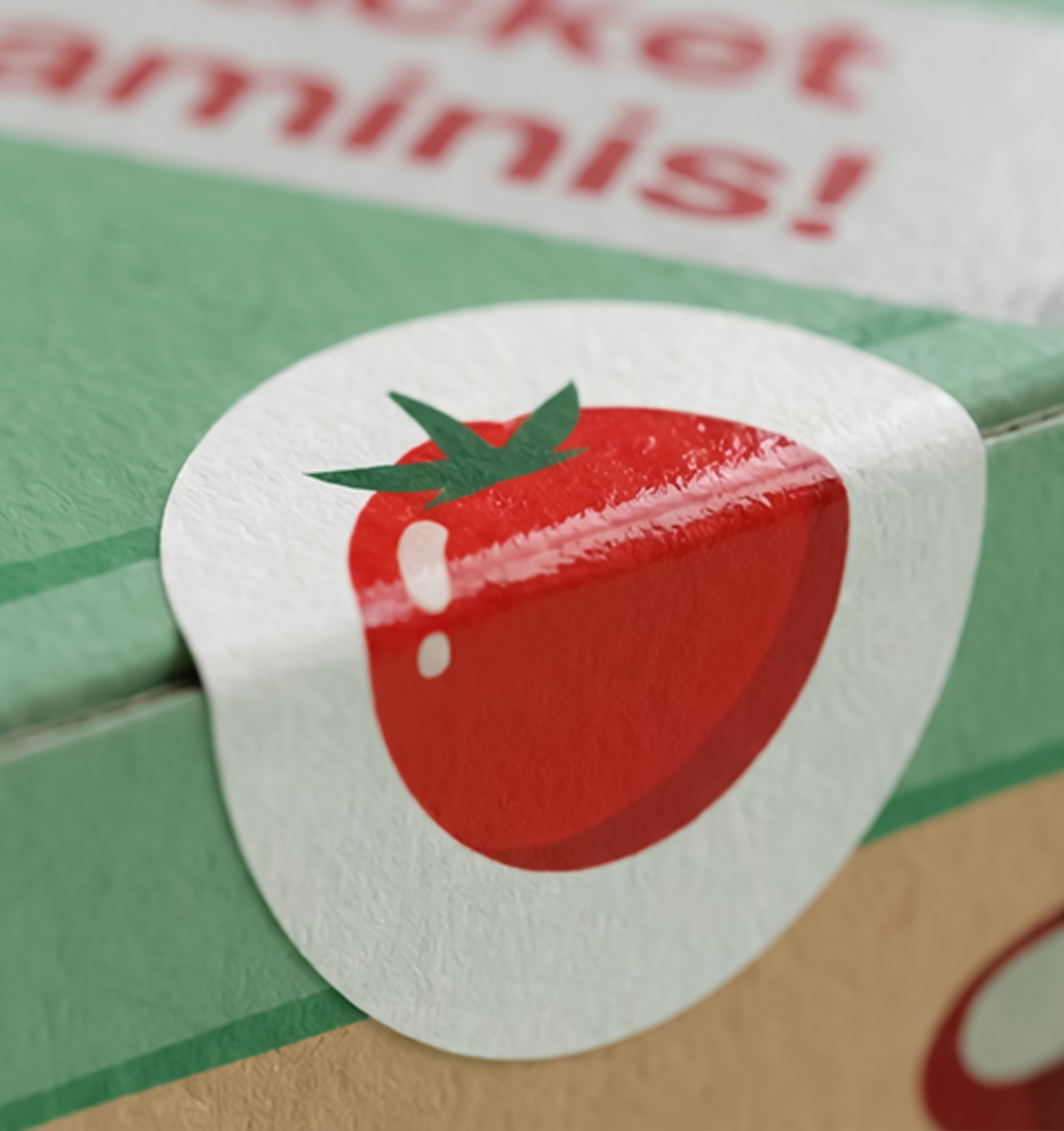
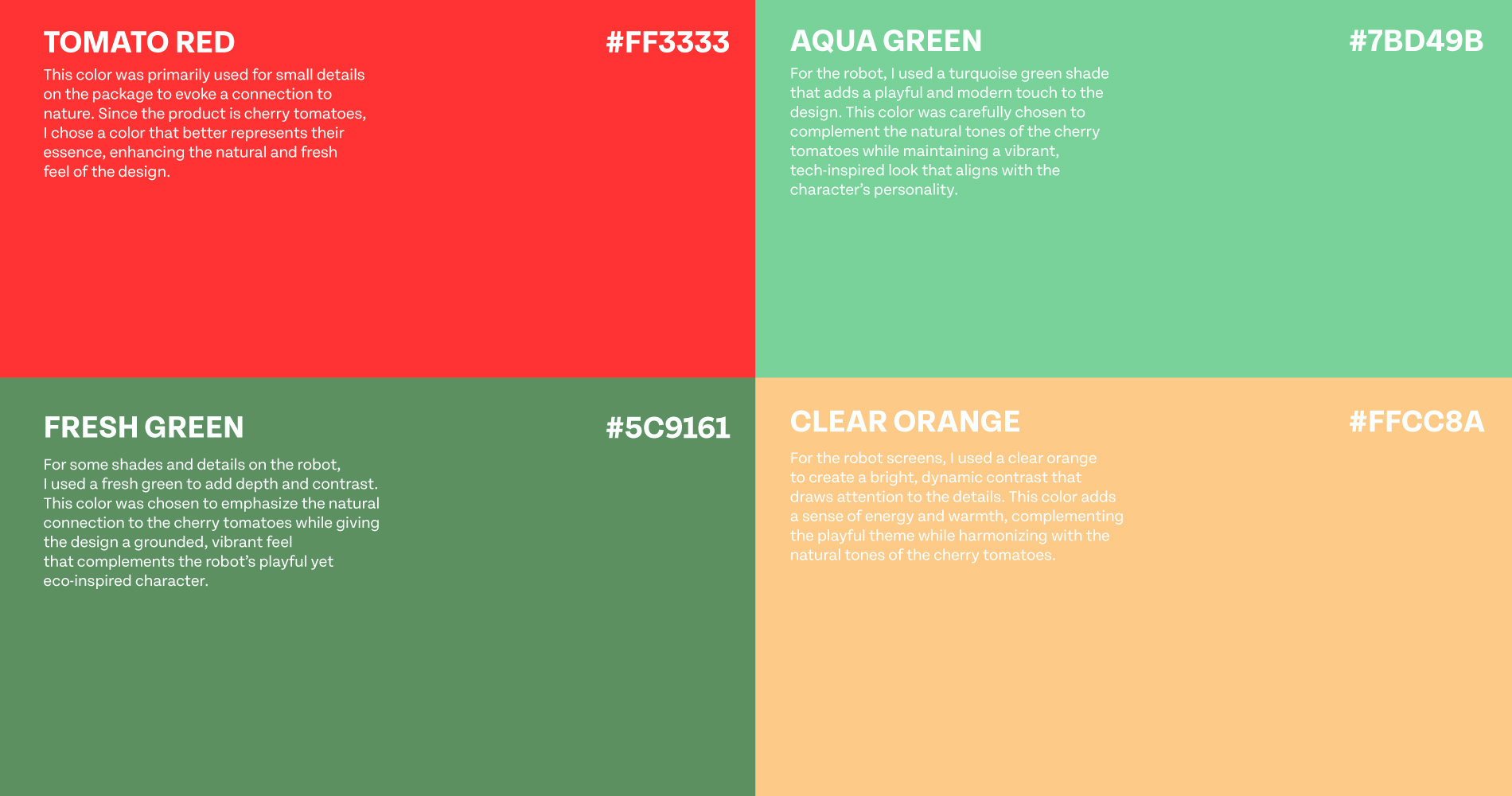
Research revealed that many healthy snack options lack the visual energy and interactivity that attract younger audiences. Inspired by toy design and character-driven brands, I developed Auto Mato, a robot-themed packaging concept that transforms cherry tomatoes into part of the character itself.
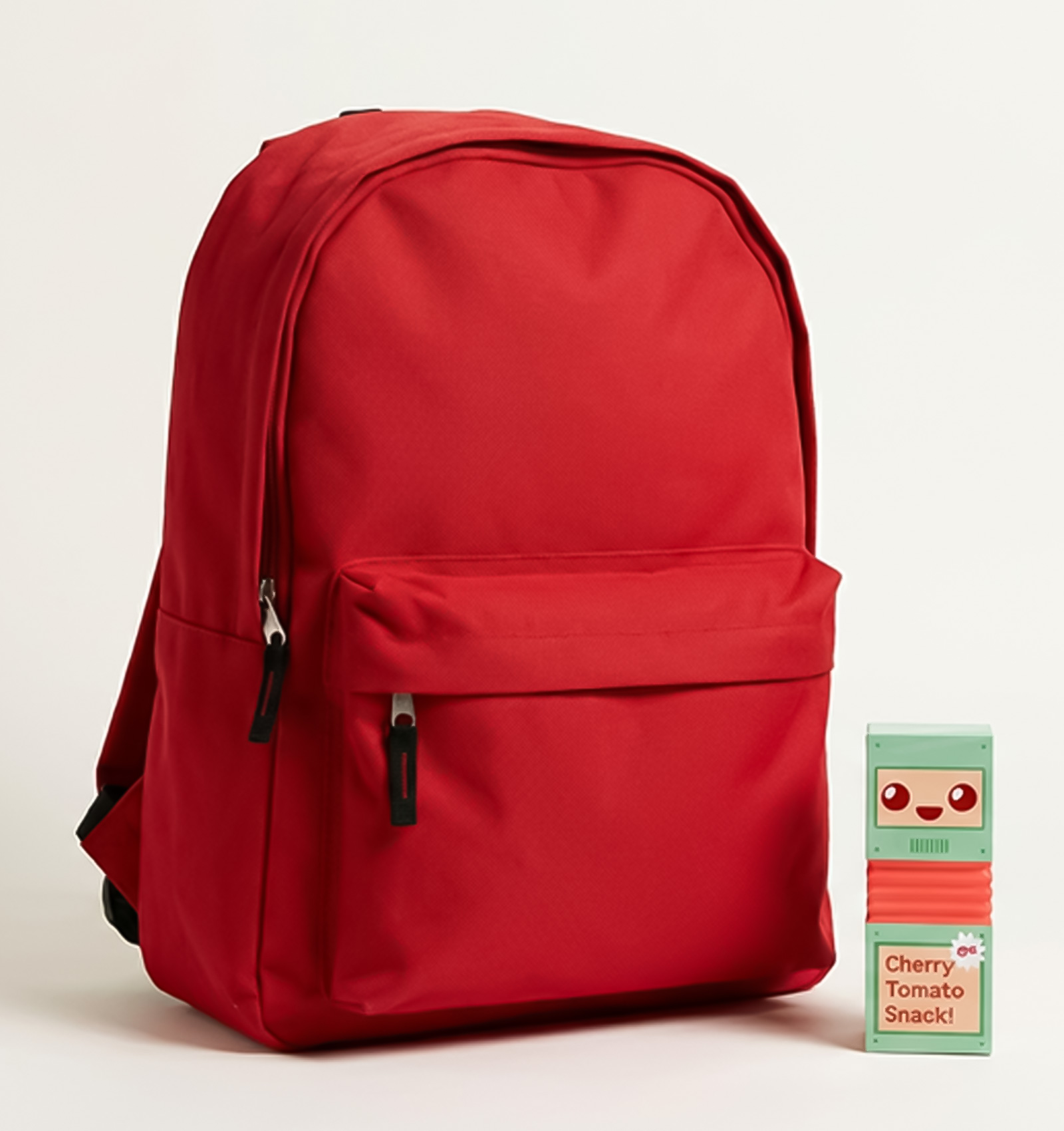
The rectangular structure features an accordion-fold mechanism, allowing the package to compress easily inside a backpack and expand during use. Beyond storage, the structure becomes part of the play experience, extending the product’s life beyond consumption.
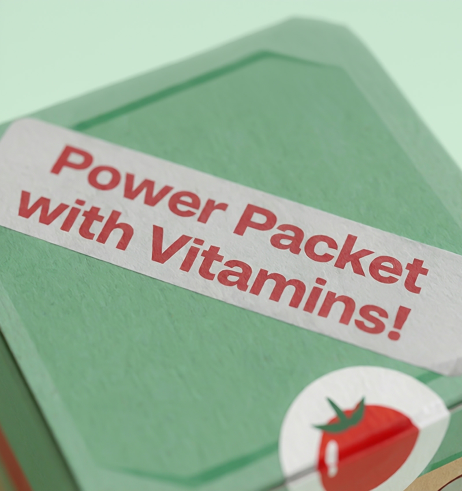
The name “Auto Mato” reinforces the playful narrative, merging automation with tomato to create a memorable, child-friendly identity.
The rectangular structure features an accordion-fold mechanism, allowing the package to compress easily inside a backpack and expand during use. Beyond storage, the structure becomes part of the play experience, extending the product’s life beyond consumption.
The name “Auto Mato” reinforces the playful narrative, merging automation with tomato to create a memorable, child-friendly identity.
The Application
The concept was developed primarily as a packaging system, with potential for expansion across other fruits and vegetables. The structural logic and character-driven approach allow the identity to scale while maintaining consistency.
The Outcome
Auto Mato received recognition in an international packaging design competition.The project strengthened my research process and deepened my understanding of structural packaging design — balancing usability, storytelling, and visual appeal within a single object.